Sunday, March 24, 2019

SQL Joins


Database Normalization: 

  • Are the tables storing logical groupings of the data?
  • Can I make changes in a single location, rather than in many tables for the same information?
  • Can I access and manipulate data quickly and efficiently?
Join: 
Working with multiple tables at once.


SELECT orders.*
FROM orders
JOIN accounts
ON orders.account_id = accounts.id;

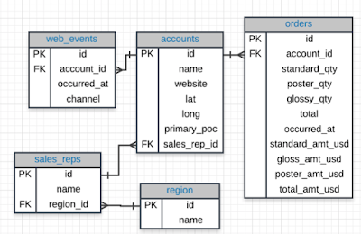
Entity Relationship Diagrams (ERD)


- Primary Key(PK): A primary key exists in every table, and it is a column that has a unique value for every row. This is the first column in each of our tables. IT is common that the primary key is the first column in our tables in most databases. 

- Foreign Key(FK): A foreign key is when we see a primary key in another table. We can see these in the previous ERD the foreign keys as below: 
account_id
sales_rep_id
region_id

Alias
FROM tablename1 AS t1
JOIN tablename2 AS t2

select a.primary_poc, a.name, b.channel, b.occurred_at
from accounts as a 
join web_events as b
on a.id = b.account_id
where a.name = 'Walmart'

Sunday, September 9, 2018

Tableau

I. Connecting to Data
In this section, you will get started with importing data into Tableau. Tableau public has fewer options, but paid versions of Tableau are quite extensive connecting directly to databases and cloud based data storage systems.

II. Combining Data
In this section, you will learn how to connect data from multiple sources for use in your visuals. If you are comfortable with SQL joins, this section should be second nature.

III. Worksheets
The visuals you create will be stored in worksheets. This is the template we will be working in for this course.

IV. Aggregations
Tableau performs aggregations of our data by default. In this section, you will learn more about how to work with different aggregations, as well as how to break your aggregations into a more granular level of the data.

V. Hierarchies
Hierarchies allow you to 'drill' into your data and questions at different levels. One of the easiest ways to think of hierarchies is in relation to time. You could look at your data at a year, month, day, hour, or another level. Moving across these levels is considered working with hierarchies.

You can also perform hierarchical calculations in other ways. Imagine you have a different companies, with different departments, and teams within those departments. This creates a hierarchy that you might want to analyze at different levels.

VI. Marks & Filters
Filtering is one of the most powerful techniques in creating dashboards. This relates to the marks portion of a dashboard, which controls the colors, shapes and other attributes of our data. You can think of this like a WHERE statement in SQL used to filter your data to only the parts you are interested in for a specific question.

VII. Show Me
The Show Me portion of Tableau controls what your ending visual looks like. There are a lot of options here. In most cases, Tableau will guess what visual you want to create, but sometimes you might have your own ideas for implementation.

VIII. Small Multiples & Dual Axis
Small multiples & dual charts are a way to visualize data that needs to share an axis for comparison purposes. This and this are great articles for explaining how these two parts of Tableau work and why you might use them.

IX. Groups & Sets
Groups and sets are two ways to categorize our data within a visualization. The difference between these two can be confusing, but we will see when and why you would use each.

X. Calculated Fields
Often you might add these fields to your dataset before adding your data to Tableau, but sometimes you want to add them to a visualization on the fly. Many of these calculated fields are things you have probably done in a spreadsheets application like finding a total or a cost per item.

XI. Table Calculations
Table calculations are often used to perform comparisons of our data over time or between groups. A great article on table calculations is available here.
Sunday, August 26, 2018

2. Design


    1. Understand the context - this means knowing your audience and conveying a clear message about what you want your audience to know or do with the information you are providing.
    2. Choose an appropriate visual display - this was covered in the last lesson. Check out the lesson titled recap in the previous section if you need a quick refresher. 
    3. Eliminate clutter - you should only provide information to the user that helps convey your message.
    4. Focus attention where you want it - build visualizations that pull attention to the message you want to highlight.  
    5. Think like a designer - you will learn a number of design principles in this lesson to assist as you start to put together your own data visualizations.
    6. Tell a story - your visualizations should give the audience a story. The most powerful data visualizations move people to take action.

    There are two main reasons for creating visuals using data:
    1. Exploratory Analysis is done when you are searching for insights. These visualizations don't need to be perfect. You are using plots to find insights, but they don't need to be aesthetically appealing. You are the consumer, and you need to be able to find the answer to your question from these plots.
    2. Explanatory Analysis is done when you are providing your results for others. These visualizations need to provide you the emphasis you need to convey your message. They should be accurate, insightful, and visually appealing. 

    The five steps of the data analysis process:
    1. Extract - Obtain the data from a spreadsheet, SQL, the web, etc.
    2. Clean - Here we could use exploratory visuals.
    3. Explore - Here we use exploratory visuals.
    4. Analyze - Here we might use either exploratory or explanatory visuals.
    5. Share - Here is where explanatory visuals live.

    Bad Visualization
    1. Don’t convey the message.
    2. Are misleading

    Chart Junk
    • Examples of chart junks


    Data Ink Ratio
    = amount of ink used to describe the data/ amount of ink used to describe everything else

    The data-ink ratio, credited to Edward Tufte, is directly related to the idea of chart junk. The more of the ink in your visual that is related to conveying the message in the data, the better.
    Limiting chart junk increases the data-ink ratio.


    • Graph with the high data-ink ratio is much easier to understand as it reduces down to a graph much simpler to understand by extracting the extraneous elements such as the background color.
    • Below chart also shows: low vs. high data-ink ratio


    Design Integrity


    • If the lie factor is above 1, the data is considered to be misleading.

    Using Color
    1. Before adding color to a visualization, start with black and white.
    2. When using color, use less intense colors - not all the colors of the rainbow, which is the default in many software applications. - use less intense colors(pastel, grey …etc.)
    3. Color for communication. Use color to highlight your message and separate groups of interest. Don't add color just to have color in your visualization.

    Designing for Color Blindness
    • Use color pallets that do not move from red to green. Instead, use colors on a blue to orange pallet.

    Shape, Size and Other Tools
    • Categorical: color and shape
    • Qualitative: size of marker

    Bad Visuals can be avoided by:
    1. Maintaining a large data-ink ratio and removing unnecessary items from visuals.
    2. Choosing visual encodings that work to highlight insights.
    3. Maintaining data integrity in the visual.

    For explanatory visuals:
    1. Focus the audience's attention on the insight you want them to act on.
    2. Use color only when necessary. Simple is often better.
    Focus on SIMPLICITY!!
    1. Tell a story.

    Tell a story
    1. Start with a Question
    2. Repetition is a Good Thing
    3. Highlight the Answer
    4. Call Your Audience To Action

    Recap
    1. How to build data visualizations for explanatory purposes.
    2. How visual encodings impact our abilities as humans to accurately perceive that information.  
    3. How chart junk distracts from the message - maximize your data-ink ratio.
    4. How to calculate lie factors and the importance of design integrity.
    5. How to use more advanced design features like color, shape, and size - make sure these are truly enhancing your message!
    6. The importance of story telling in communicating with data.


1. Intro to Data Visualization


    For qualitative data, if we are just looking at one column worth of data,
    We have these 4 common visuals:
    1. Histogram
    1. Normal Quantile Plot
    2. Stem and Leaf Plot
    3. Box and Whisker Plot

    For categorical data, if we are looking at just one variable(column), we have three common visuals:
    1. Bar Chart
    1. Pie Chart
    2. Pareto Chart

    Scatter Plots
    • Correlation coefficient: the strength and direction of a linear relationship
    • Commonly denoted by r (-1 < r < 1)
      • +1: positive linear correlation
      • -1: negative linear correlation
      • 0: no linear relationship
    • Strength: Weak, Moderate, Strong
    • Direction: Positive, Negative, None

    Strong                               Moderate                               Weak
    0.7≤∣r∣≤1.00.7≤∣r∣≤1.0              0.3≤∣r∣<0.70.3≤∣r∣<0.7                     0.0≤∣r∣<0.30.0≤∣r∣<0.3


    Line Plots
    • Line plots are a common plot for viewing data over time.
    • Allow us to quickly identify overall trends, seasonal occurrences, peaks, and valleys in the data.
    Ex) stock prices over time

    Recap
    1. You motivated the need for data visualization by showing that summary statistics don't tell the full story. You saw datasets where the summary statistics were the same, but the actual data were very different!
    2. You did a review of data types. In general there are quantitative and categorical variables. Quantitative variables can be either discrete or continuous, while categorical variables are either ordinal or nominal.  
    3. You looked at univariate plots. In most cases a histogram should be used for quantitative data, while a bar chart should be used for categorical data. There are some cases where you might use one of the other plots.
    4. You then looked at bivariate plots, where you were comparing two variables to one another.  Scatter plots are the most common way to visualize two quantitative variables, while a line chart is common for data that you are watching over time. If you are comparing two categorical variables, the best choice is probably a side-by-side bar chart.
    5. You learned about correlation coefficients, which provide the strength and direction of linear relationships. You learned a rule of thumb for determining whether the relationship between two quantitative variables is strongmoderate, or weak.
    6. You then looked at cases where we had more than two variables. You learned that using these plots effectively is about building the plot that helps you see the insight that answers the question you have.
    7. You gained some insight into visual encodings and data dashboards, which will be a part of the next lessons!


Tuesday, August 14, 2018

SQL Aggregation Functions

COUNT
SUM
Min and Max
Average

NULL
: no data, different from 0 or no data
: it is a property,
so in a query, after where clause, it should be:
IS NULL
IS NOT NULL

COUNT
only counts values that are not NULL
SELECT COUNT(*)
FROM accounts;

SUM
- Can only be used with numerical values
- NULL values are considered as '0'

MIN/MAX
- Min will return the lowest number
- Max will return the highest number/ the latest date/ the non-numerical value closest alphabetically to 'z'

AVG
- Ignores NLLL values
- Can only be used for numerical data

GROUP BY
- Group by can be used to aggregate data within subsets of the data. For example, grouping for different accounts, different regions, or different sales representatives.
- Any column in the SELECT statement that is not within an aggregator must be in the GROUP BY clause.
- The GROUP BY always goes between WHERE and ORDE BY.
- ORDER BY works like SORT in spreadsheet software.

DISTINCT
- returns unique rows

HAVING
- 'clean' way to filter a query that has been aggregated, but this is also commonly done using a subquery.
- Any time you want to perform a WHERE on an element of your query that was created by an aggregate, you need to use HAVING instead.

DATE
 - DATE TRUNC


CASE
SELECT account_id, CASE WHEN standard_qty = 0 OR standard_qty IS NULL THEN 0
                        ELSE standard_amt_usd/standard_qty END AS unit_price
FROM orders

LIMIT 10;

Friday, July 27, 2018

Basic SQL

Entity Relationship Diagram(ERD): 
ERD is a common way to view data in a database.
It helps you visualize the data you are analyzing including:

  1. the names of the tables.
  2. the columns in each table
  3. the way the tables work together


SQL (Structured Query Language)

  • easy to understand
  • access data directly
  • easy to audit and replicate
  • multiple tables at once
  • allows you to analyze more complex questions than dashboard tools like Google Analytics


Why Do Business Choose SQL?

  1. Data integrity is ensured. 
  2. Data can be accessed quickly. 
  3. Data is easily shared. 


Types of Statements

  1. Create table: creates a new table in a database
  2. Drop table: removes a table in a database
  3. Select - query: allows you to read data and display it. 


Select & From

  • Select: tell the query what columns you want back. 
  • From: what table you are querying from. 


select *
from demo.order

Queries
LIMIT

  • seeing only a few lines of data 
  • in MySQL, used as 


select top 10 *
from orders;

ORDER BY

  • order out table by any row 
  • default: ascending order / put 'desc' at the end for descending order

select *
from web_events
order by occurred_at desc


  • create an order within the order

select occurred_at, total_amt_usd
from orders
order by total_amt_usd desc, occurred_at desc
limit 5

WHERE
subset out tables based on conditions that must be met. 
when finding non-numeric values, put a single quotation mark
  1. > (greater than)
  2. < (less than)
  3. >= (greater than or equal to)
  4. <= (less than or equal to)
  5. = (equal to)
  6. != (not equal to) 

select * 
from orders
where gloss_amt_usd > 1000
limit 5

select name, website, primary_poc
from accounts
where name = 'Exxon Mobil'

DERIVED COLUMN
common operators include: 
  1. * (Multiplication)
  2. + (Addition)
  3. - (Subtraction)
  4. / (Division)

select id, account_id, standard_amt_usd/standard_qty as unit_price
from orders
limit 10

LIKE
This allows you to perform operations similar to using WHERE and =, 
but for cases when you might not know exactly what you are looking for. 
  • Wildcards(%)
  • Case-sensitive

select * 
from orders
where account LIKE '%google%'

select name
from accounts
where name like 'C%'

IN
This allows you to perform operations similar to using WHERE and =, 
but for more than one condition.

select name, primary_poc,sales_rep_id
from accounts
where name in ('Walmart', 'Target', 'Nordstrom')

NOT
This is used with IN and LIKE to select all of the rows NOT LIKE or NOT IN a certain condition.

select name, primary_poc,sales_rep_id
from accounts
where name NOT in ('Walmart', 'Target', 'Nordstrom')

select *
from web_events
where channel NOT in ('organic', 'adwords' )

select name
from accounts
where name not like '%s'

AND & BETWEEN
These allow you to combine operations where all combined conditions must be true.

select * 
from orders
where standard_qty > 1000 
and poster_qty = 0
and gloss_qty = 0

select * 
from accounts
where name NOT LIKE 'C%' 
AND NAME NOT LIKE '%s'

select * 
from web_events
where channel in ('organic', 'adwords')
and occurred_at between '2016-01-01' and '2017-01-01'
order by occurred_at desc

OR
This allows you to combine operations where at least one of the combined conditions must be true.

select id
from orders
where gloss_qty > 4000 or poster_qty > 4000

select *
from orders
where standard_qty = 0 or (gloss_qty > 1000 or poster_qty > 1000)

select *
from accounts
where *name like 'C%' OR NAME LIKE 'W%' )
and (primary_poc LIKE '%ana%' or primary_poc LIKE '%Ana%')
and or primary_poc NOT LIKE '%eana%'


Summary
StatementHow to Use ItOther Details
SELECTSELECT Col1, Col2, ...Provide the columns you want
FROMFROM TableProvide the table where the columns exist
LIMITLIMIT 10 Limits based number of rows returned
ORDER BYORDER BY ColOrders table based on the column. Used with DESC.
WHEREWHERE Col > 5A conditional statement to filter your results 
LIKEWHERE Col LIKE '%me%'Only pulls rows where column has 'me' within the text 
INWHERE Col IN ('Y', 'N')A filter for only rows with column of 'Y' or 'N'
NOTWHERE Col NOT IN ('Y', 'N')NOT is frequently used with LIKE and IN
ANDWHERE Col1 > 5 AND Col2 < 3 Filter rows where two or more conditions must be true 
ORWHERE Col1 > 5 OR Col2 < 3Filter rows where at least one condition must be true
BETWEENWHERE Col BETWEEN 3 AND 5Often easier syntax than using an AND

Saturday, July 21, 2018

Spreadsheets 3: Visualize Data

Pie Charts:
- Show proportions
- Divide the whole pie into different pieces

Bar Charts:
Comparing category values against other values

Scatter and Line Plots:
- Useful for displaying bivariate numerical data.
- This means a data set with two variables, such as height and weight measurements for a list of human beings.

Histogram: 
- A column chart that measures the frequency of data in a data set.
- A histogram is only associated with quantitative data sets.

Box Plot: 
Visualization of data statistical spread including 1st, 2nd, and 3rd quartiles plus max and min.


When you are presenting data, think about: 
1. What questions are we answering?
2. What patterns are we trying to show?
3. Who is the audience?
4. Overview or in-depth?

SQL Joins

Database Normalization:  Are the tables storing logical groupings of the data? Can I make changes in a single location, rather than in...